Concept
Reflection of the spiritual and pedagogical culture of St Aloysius’ College.
Layout and design
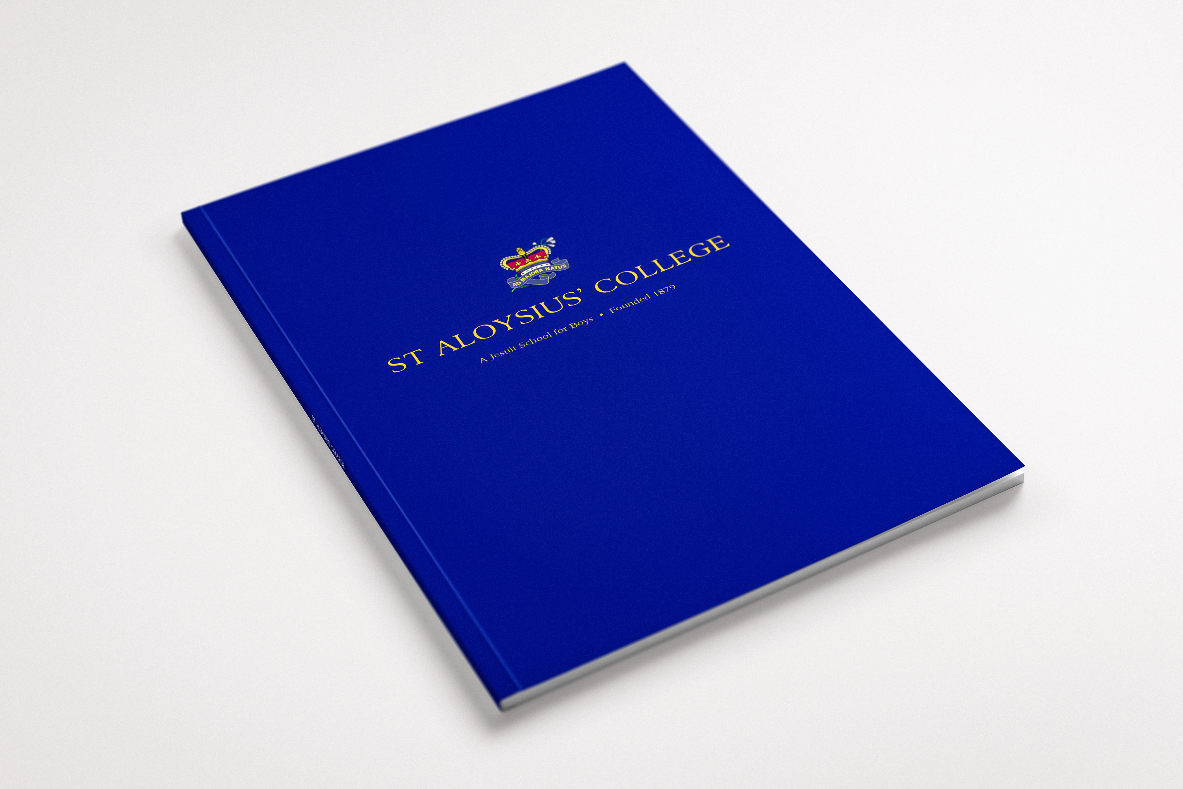
Cover
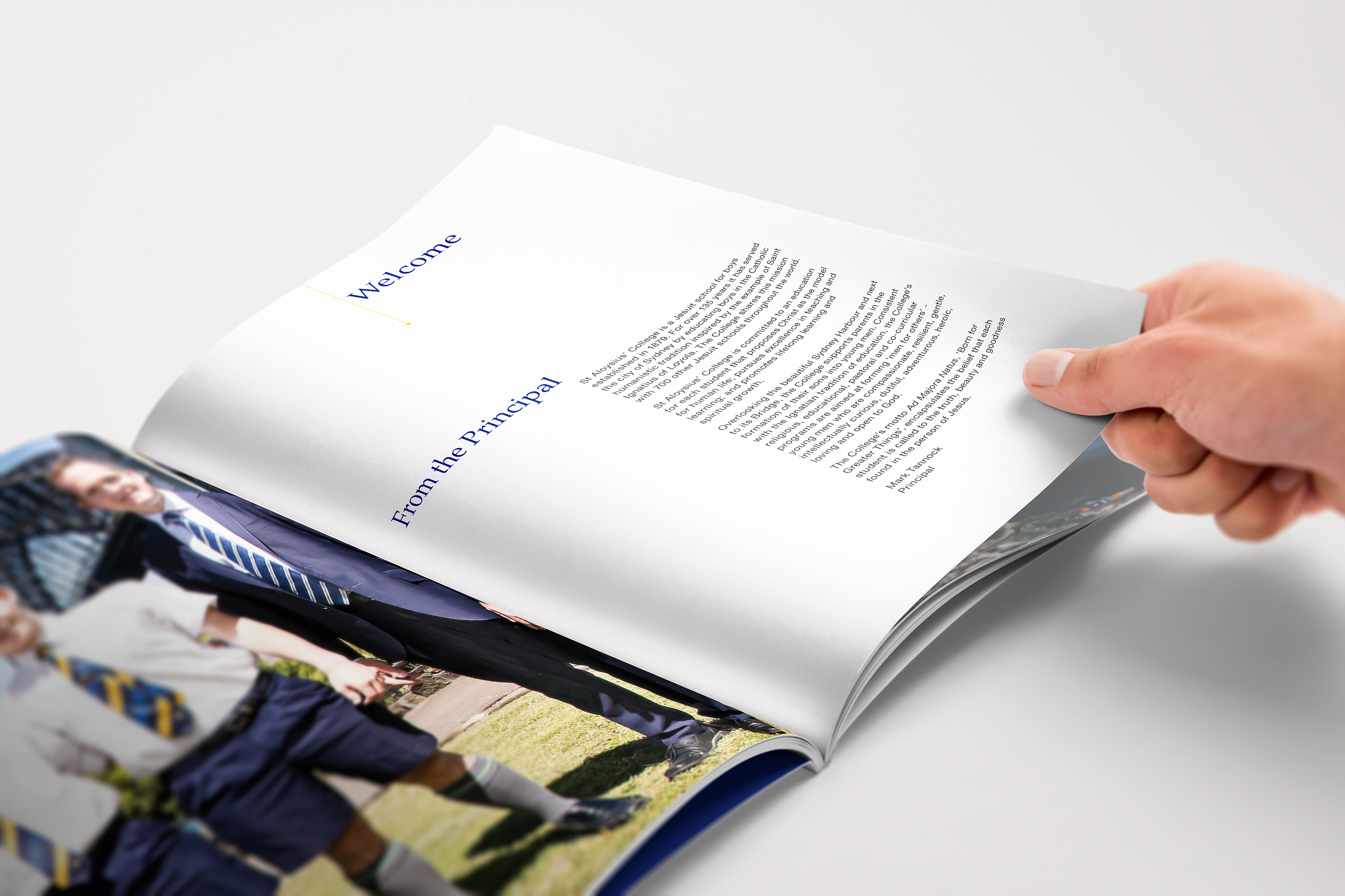
In order to reflect the concept, the front cover is confident, harmonious and symbolic of St Aloysius’ College. The primary logo has been used on the front to clearly identify the prospectus to those who do not have a strong knowledge of the college. The blue reflecting a harmonious and confident feeling. The inside front and first page use the School’s Gold with an image of a quietly confident boy. This evokes not only an instant connection with the St Aloysius’ College but also gives a warm welcome.
Inside pages
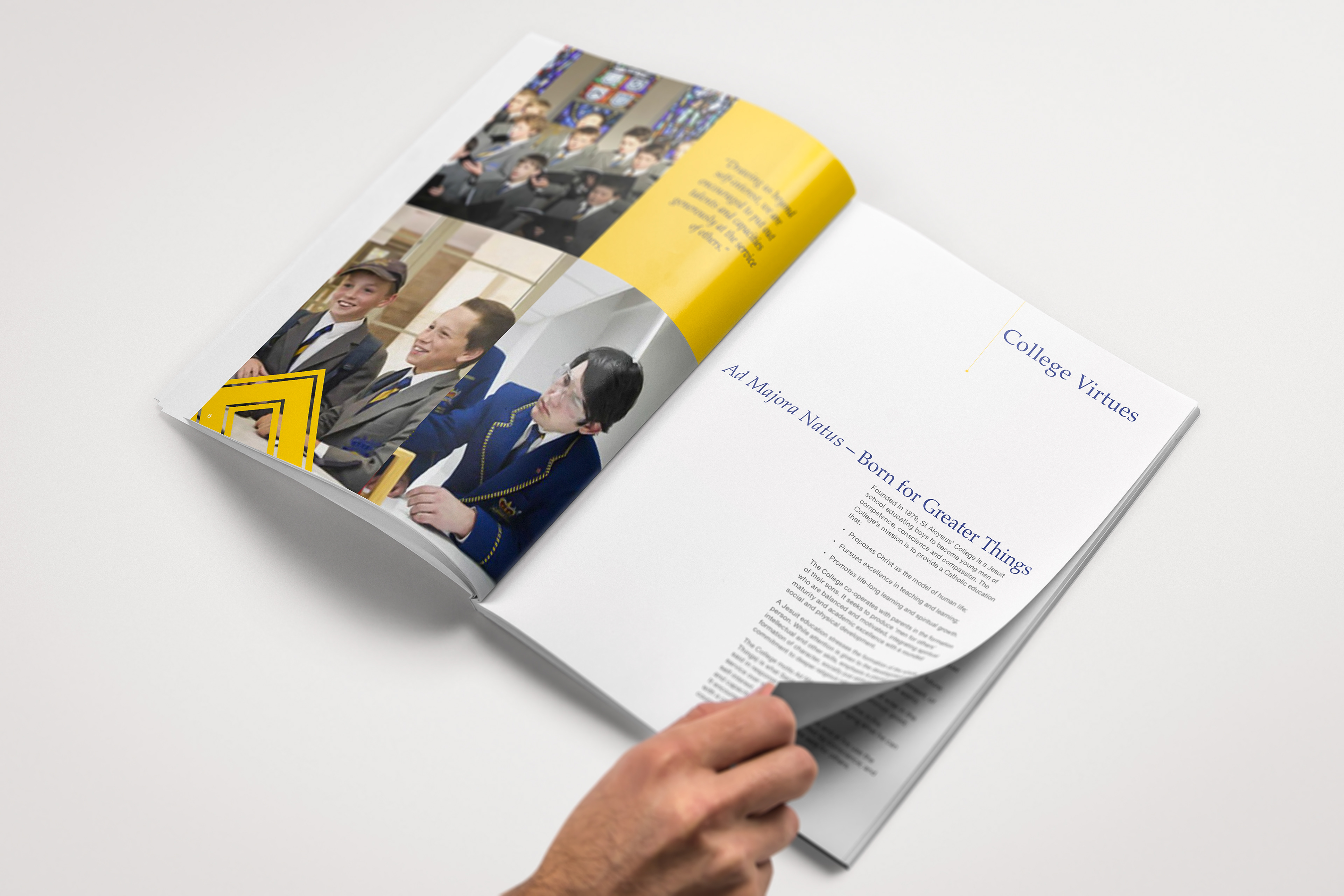
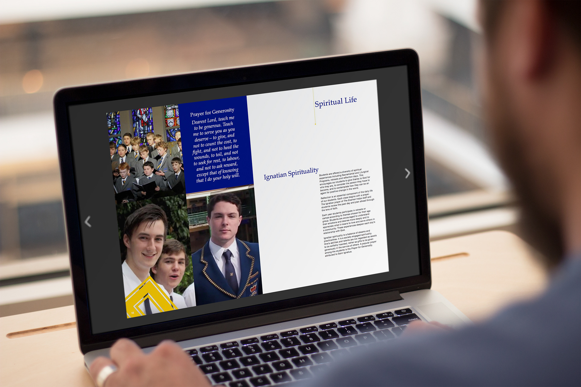
The inside design and layout of the pages is a reflection of not only the students but also the connection with the Catholic faith and the Jesuit education of boys.
I have created a design that uses full page images to show the boy’s education as a dynamic space where they have a broad range of co-curricular and educational programs forming them into ‘men for others’. The images reflect and complement the nature of the text whilst also delivering their own story of striving for excellence.
The layout of the text pages and combined images with quotes are a subtle influence from the one symbol that reflects religion and is the one identifying symbol that can be clearly seen on the outside of the St Aloysius’ College building - the Crucifix.