First impressions count.
Elegant, Sophisticated, Functional
Brief: Create a prospectus for Queenwood that embodied the words above, as well as capturing the essence and spirit of the School, whilst conveying the utilitarian content required for parents wanting to know about Queenwood.
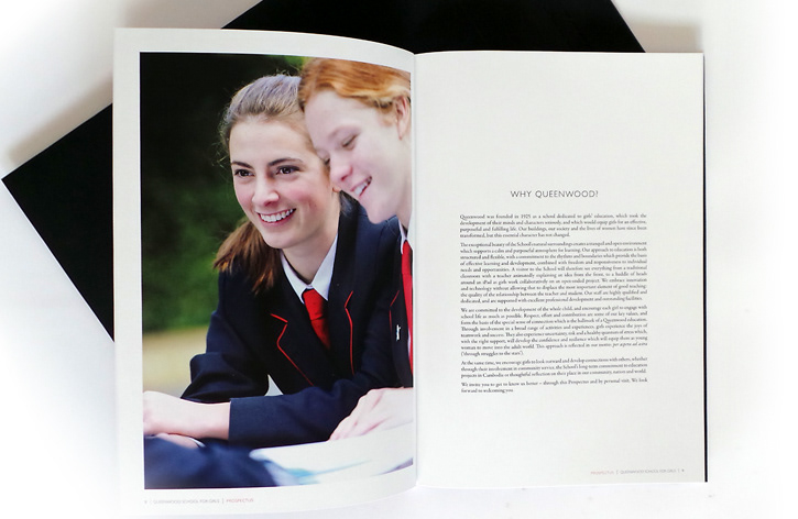
Solution: Creating a story and feeling of any institution within publications is not only done with words but also with the use of some beautiful photography. Art directing the photoshoot for this meant creating story boards of images that not only reflected the content but also showed the students in a range of activities.
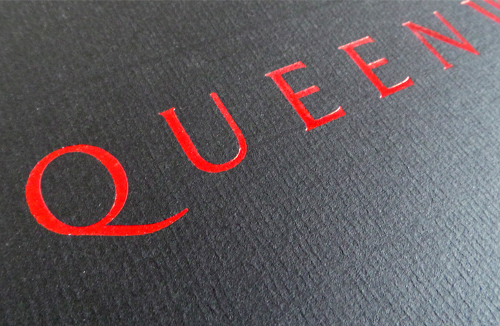
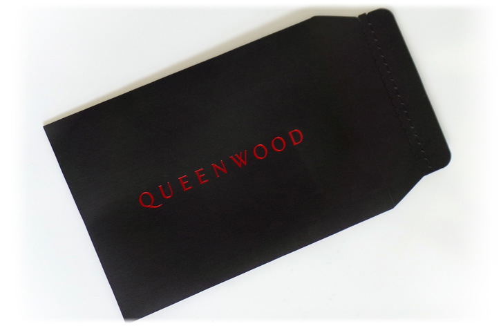
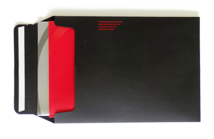
Concept: ENVELOPE - Create a beautiful, sophisticated envelope that when it comes in the post, it actracts the viewers attention straight away and is the first thing to be opened but is it instantly recognisable as Queenwood. This final design was created in congunction with Australia Post so that the front of the envelope was completely clean of everything except the logotype. Conqueror Woven was choosen as the stock to give textural touch and the red foil aiding in the sophistication.
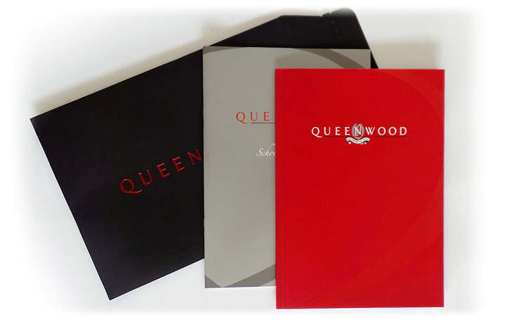
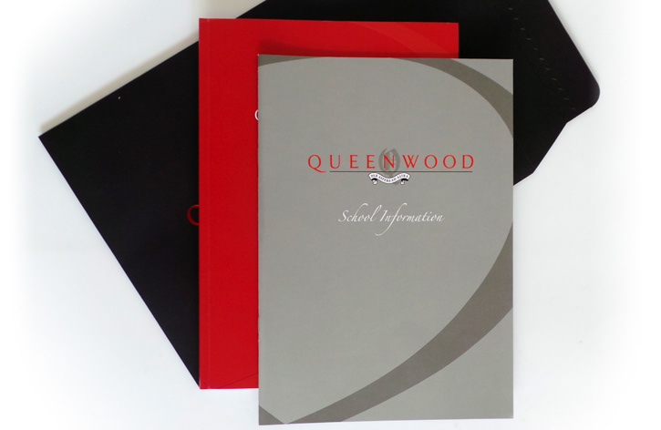
BOOKS - I created two books due to the fact that there would be content that would need to be updated on a yearly basis. One being the premier hero book and the other containing the day to day running of the school content.
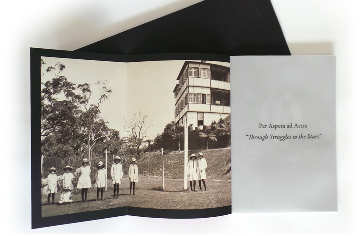
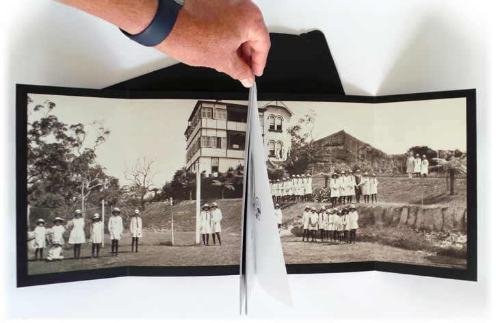
The concept behind the hero book came about when the School received a photograph from an Old Girl that had been in her family since the School opened. It was perfect to go on the inside front and back covers to create a wrap around image. Thus creating a feeling of the history of the school encassing the content of the new.
The use of some key layout design rules, like the use of white space, double page image spreads with key quotes and keeping the content tight and easy to read in small sections allows for an elegant final design.